
The CV, and especially the Cover Letter, are concepts of the past. A portfolio website is the thing of the future. Do you agree? Well, in this case, you might like this blog post!
As Digital Marketing executives, our work tends to be extremely creative and complex. As well, the Digital Marketing work field is growing and competition is more intense every year. In these circumstances, we definitely need to pay more attention to delivering great first impressions.
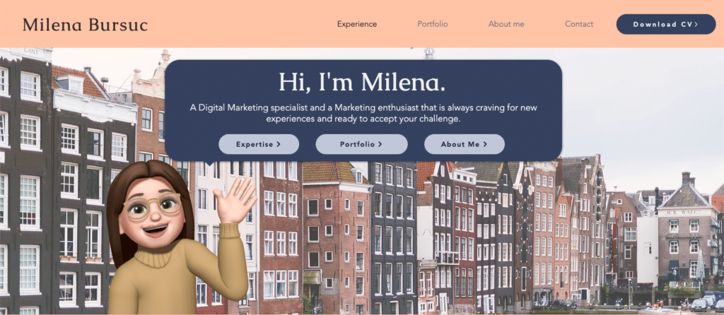
A portfolio website is a great tool to show your job experience, passions and ambitions in an extremely visual and appealing way. Not only will you stand out from many other applicants to your dream job, but you’ll prove your sense of commitment and creativity.
Nevertheless, a portfolio website is not a CV and user experience principles play an important part in how professional and useful your website will be perceived.
In this blog post I will address a few questions:
- How to create your own portfolio website?
- What are some essential UX principles for your portfolio website?
- What CSM platforms can you use to build your portfolio website?
Portfolio Website: Concept & Planning
Before you start designing your portfolio website, you need to come up with a concept and clearly plan it out.
Coming up with the concept
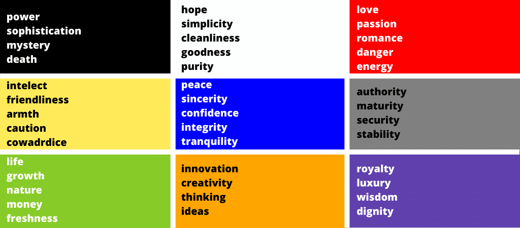
Let’s start with the concept. First of all, a portfolio website should be a clear reflection of your professional self, but most importantly personal. Let me explain! Being an acting professional is a standard practice that will most likely not help you stand out nowadays. Instead, being genuine and unique is becoming more appreciated in workplaces. An effective way to stand out when building your personal branding is to be yourself.
Therefore, when picking out your portfolio website’s brand style, fonts and colours, definitely think about your own daily style and what you personally like!
Tip: Keep a consistent personal branding among different platforms and materials you might be using: Social Media channels, and specifically LinkedIn; CV & Cover Letter documents; etc.
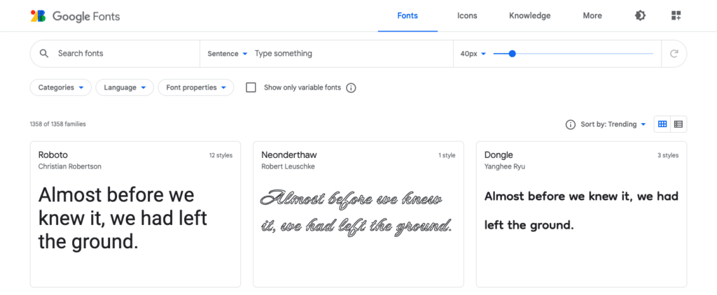
If you need to choose your own font, browse through the Google Fonts library. There is a large library of fonts and they are all downloadable for use on other platforms.
Get inspired
Once you define the elements that will become your personal branding on the website, it’s time to get inspired.
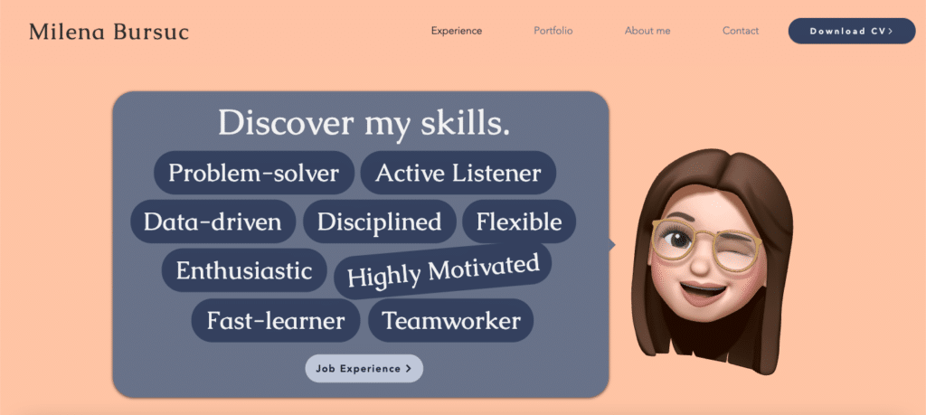
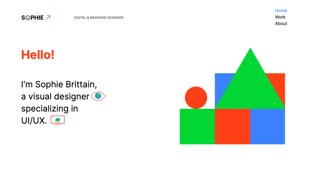
You might already have an idea of how you’d like your website to look, how many pages will it have and what will be the content. Nevertheless, before you start designing, explore examples of portfolio websites online. A great tip is to not stick to Marketing Portfolio Websites, but also pay attention to UX Design or Digital Design Portfolios. Those are normally more creative and outstanding, and although the content or the layout might not necessarily meet your needs, you can definitely apply specific details to take it to the next level.
Where to find inspiration? Check this list of 20 best portfolio websites put together by Wix.
Contents
Now that you definitely know how you’d like your website to look, think about how will you add value? In other words, why is your portfolio website going to be useful to those that visit it?
To give you some ideas, you might include (or re-design) your CV, represent your portfolio, showcase your projects, provide a contact form and contact details, display your personal story, or even start your own blog on topics that you’re passionate about.
First, think about the message you’d like to pass on, and then, again, get inspired from similar portfolio websites to see what else can you include in your website.
Web-design & user experience
When building any website you should be considerate of your visitor’s experience on-site, but also take into account what are the web-design standards. You don’t want to make your portfolio website look outdated, nor do you want to provide a minimal user experience. These can make your user doubt your greatness, but also motivate them to leave the website when it doesn’t fit with their high expectations.
In this case, research well web-design trends and UX design principles, define which ones you can apply to your own website and implement them!
For an overview of web-design trends for 2022, check WebFlow’s blog post.
UX Principles for your Portfolio Website
1. Keep your persona in mind
First of all, consider who your target audience is and make the content, as well as the design, be relatable to the user.
Portfolio Websites are a different kind of product, and their “customers” are also different.
Consider your persona:
- Who is likely to visit your website? Recruiters, business owners or other professionals in the field?
- What would be their goals and challenges? Consider their daily struggles in the recruiting process, for example.
- What are their searching habits? What channels do they use to research potential candidates and what key terms do they insert in search bars?
- What are their expectations? Consider the kind of content and formats they are used to, how can you keep your website as close to their expectations as possible?
If you’d like to learn more about buyer personas, read the “Drafting buyer personas for your Digital Marketing Plan” blog post on the Digital Marketing Minor blog. If you’d like to learn more about customer journey mapping, read the “Customer Journey Mapping: An explicit overview” post on the Digital Marketing Minor Blog.
2. Make your website easy to scan
Users are nowadays overwhelmed with information coming in at different times and from different sources. As content producers, we fight for their attention. The truth is website visitors don’t read, they scan!
Therefore, design your website to be scannable. This means that the visitor should understand at a glance what a website and a page are about and whether he wants to explore more.
One personal tip is to make your website extremely visual and minimize your text to the maximum. If you have a paragraph of text, consider how could you replace it with an infographic, for example.
3. Make the navigation clear and simple
Again, users don’t read, they scan. Additionally, they don’t have much time and they tend to give up easily. Therefore, make your calls to action as clear as possible, and constantly consider how can you make the navigation process easier for the user.
By easy navigation what I mean is that you need a clear hierarchy of the website, in terms of pages, and internal structure with links. As well consider the current and desired customer journey on the website to better understand how you can best place design elements.
4. Responsive design
Nowadays we are spoiled with highly interactive, engaging and dynamic websites. If a user’s action is not accompanied by hover effects or animations, they might think something went wrong or that your website is frozen!
What will truly make the difference is to implement page transitions, element animations and button hover effects that are triggered by the user’s actions on the website.
5. Consistency
We talked about personal branding before and about defining your own brand elements: style, colours and fonts. So, on the website, keep these consistent across pages.
6. User Interface
If the user interface is well thought, then users will want to spend more time on your website. Some tips are to utilize your page layout efficiently, keep only relevant information, and avoid infinite scrolling.
7. Optimize your website for mobiles
Mobile websites are prioritized over desktop websites, therefore also your portfolio website should provide an optimal user experience when viewed from mobiles. As well, again, consider your persona and at what times and what circumstances will your audience visit your website.
CMS platforms for your Portfolio Website
There are many CMS platforms to build your own portfolio website, however, you probably wish to use something that is easy to use and beginner-friendly.
I personally recommend using Wix to build and design your portfolio website. First of all, there are many templates you can get inspired from or even start your own website. As well, it is beginner-friendly and doesn’t require any coding or plugins. It is also very flexible and allows you to get creative.
Want to know more about web-designing? Check out this video from Wix.
As well, check out these 10 website tutorials from Wix to better understand how it works and what possibilities it provides.
Thank you for giving this blog post a chance! I hope you find it useful. Feel free to let me know any of your feedback or suggestions. Happy learning!

0 Comments